overview
problem
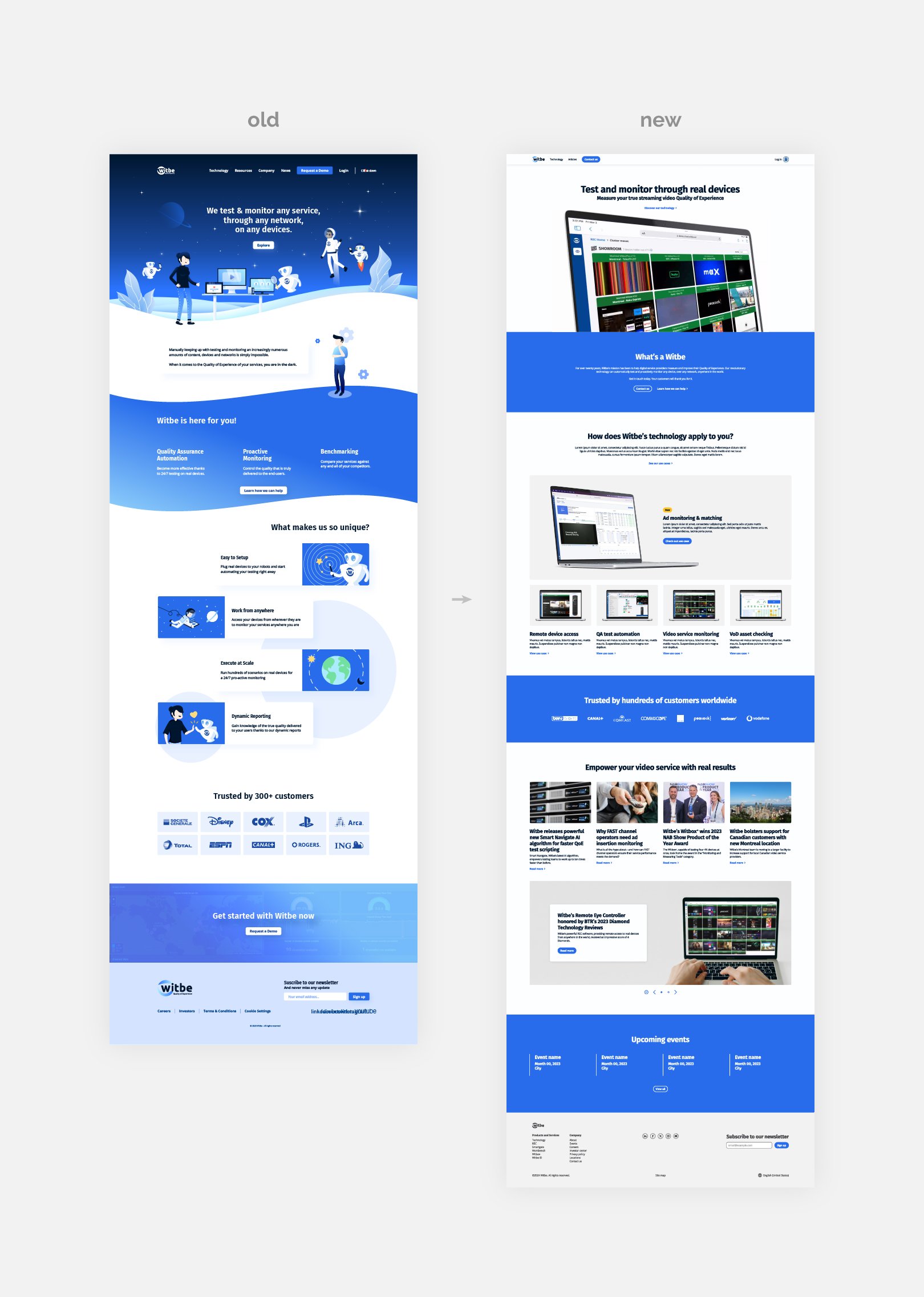
Witbe is a B2B SaS business, offering software and proprietary hardware to video service providers. The software’s capabilities and its relationship to the hardware became a difficult topic to digest as services grew. Witbe’s software offers automated testing and monitoring services that can assist video service providers.
New and existing users found it difficult to understand Witbe’s unique selling proposition and could not easily find information relevant to them.
solution
Proposal:
Restructure user journey, improve technical content presentation, and emphasize Witbe’s unique USP.
Method:
Apply an evidence-based methodology that keeps users in mind throughout the design process in order to create a solution that is easier to navigate, learn, and understand.
Definition and ideation:
• Workshop design and facilitation
• Archetypes and ecosystem sketch
• Current state journey map
role: project manager, product designer
In the three months to its release of 1.0, I worked with stakeholders through all facets of research, design, and development. Shortly after launch, I was promoted to product owner to refine our workflow, feed the product road map, and design and manage content and publications.
responsibilities:
research
summary
A shortcoming of the previous website was that it was presented itself as a technical write-up of what Witbe can do. My goal was to identify Witbe’s target market and what information and services they are seeking in the industry. Below, I’ve listed strategies I employed during the each stage of research. These strategies helped me gather context, understand users’ goals, define those goals and effectively share them with stakeholders and members of my team.
After reorganizing the structure of the website and creating the first versions of the redesign, I aimed to confirm my design decisions by conducting split tests. The target audience was selected from a group of current Witbe customers. I presented the old and new websites and asked the subjects to navigate the websites and complete tasks while narrating their actions and rationales. This method helped me confirm my suspicions about the old website’s dysfunction and helped me better understand what users might look for in a new website. By tailoring the subjects to existing Witbe clients, I felt that I was able to better isolate the goals of more technical users in the industry. I defined three goals that lead the design:
Organize information by popular client use cases
Promote engagement with more prominent calls to action
Emphasize Witbe’s B2B sales model
discovery
feature prioritization
I hosted an interactive workshop to record and prioritize what information the stakeholders would like to see on the website. Participants wrote ideas on sticky notes and together we categorized and ordered each topic by bucket and importance.
feature prioritization
For this process, I employed an impact-effort matrix. This involved categorizing features into four categories, quick wins, big bets, money pits, and fill ins. Features were placed in the matrix based on impact vs expense. This process sorted the roadmap.
inspiration
I admit I do not always make up designs instantly in my head. I take some time to research competitors, similar industry websites, and current design publications in order to establish trends and how to create a forward-thinking design.
competitive analysis
I assembled a small sample of 10 users from a list Witbe’s clients. I made my selections from a variety of fields and time spent as Witbe customers. I hoped that by diversifying the selection, I could gather a better understanding of general user goals. I observed and performed interviews while users explored the website. I took note of their notes, questions, and interactions.
user personas
After gathering some context on clients and target market, I built personas to get a better picture of what a human’s objectives might be when searching for products and services similar to Witbe.
site map
Once I confirmed a final set of pages to be launched, I created a site map. This map established where and how each page could be reached.
low-fidelity wireframes
After creating wireframes and studying designs, I got to work blocking out the layout and general feel for the pages. Creating this foundation early prevent making expensive changes later in the process.
contextual inquiry
I assembled a small sample of 10 users from a list Witbe’s clients. I made my selections from a variety of fields and time spent as Witbe customers. I hoped that by diversifying the selection, I could gather a better understanding of general user goals. I observed and performed interviews while users explored the website. I took note of their notes, questions, and interactions.
ideation
design process
My process begins with gathering as much information from my research and from clients as possible. This helps me start with a clear understanding of the project’s goals and target audience. As Witbe’s acting Art Director and Senior Designer, I am very familiar with the brand identity.
Background
I studied Witbe’s industry, clients, competitors, and current design trends. This method allowed me to understand industry standards but also create an innovative design that will stand out from the competition.Collaboration
I presented my findings with the stakeholders. I hosted ideation meetings and facilitated workshops focused on defining user goals and how they could be reflected in the design. Afterward, I constructed a product roadmap and prioritization grid and refined them with the stakeholders.Mockups and prototyping
Based on the discussion and research, I created mockups and preliminary sketches of potential user paths.Feedback
I created and presented mockups of a few pages to the stakeholders for feedback and explained the potential user paths I had in mind. I believe it is important to complete this step early in the design process to ensure we are working towards the same goals and making changes when they are less time-consuming.Refinement
Based on the feedback, I made adjustments, refined, and finalized the visual design. During this step, I implemented brand elements like type, color, and other identifying elements and principles. I gathered feedback and continue to refine and tweak the design as needed.
The production process followed design and the product roadmap planned around 2–3 month release cycles. I divided the roadmap into phases, each phase containing a share of tasks from the prioritization grid depending on stakeholder priorities. (For example, top nav > use cases > product pages)
I created a guide on the design system and distributed it to my team. This guide was employed by writers, designers and devs. Sharing this resource helped writers decide how content would fit in components, designers could work around dev limitations, and devs knew exactly what to expect and could build before receiving content.
visual design
Understanding and creating designs that are aligned with brand guidelines is important, needless to say. In order to create a consistency and integrity in brand identity, I have a little system in place.
Brand study
First, I review the brand guidelines and study deliverables and make sure I understand the key elements and identifiers I need to incorporate into the design.Mood board
I like to create a mood board or style guide to gather inspiration. By putting a few deliverables and brand materials together in one place, it makes it easier to find consistencies and create rationales for identifying design decisions.Cheat sheet
While I’m working on the design, I always keep the guidelines and mood board open and visible. I frequently refer to my “cheat sheets” to ensure my design is meeting necessary rules and requirements. This includes paying attention to things like fonts, sizes, color schemes, margins, etc.Reviews and critiques
I always seek feedback from my team and stakeholders to make sure my design is up to snuff and following all the rules. Design feedback helps keep the design consistent will point out any design weirdness. Stakeholder feedback ensures proper communication of the message of the company.
To measure this approach, I conducted a survey with a handful of our clients and found that the majority found the new design to be consistent with other brand deliverables they’ve received. The new designs led to a 36% increase in engagement time and 198% increase in event count, indicating my design met the brand standards and effectively communicated the product’s goals.
Please check out my Witbe branding case study if you would like to learn more about the rebranding process.
results
After publishing the first version of the website, views, active users and event count doubled. I believe that these numbers were a direct result of design tailored to user goals.
views
+215%
users
+178%
*July 2022–2023
average engagement time
+36%
views per user
+13%
event count
+198%
conversions
+443%
reflection
Witbe’s web presence was my first experience directing a project from start to finish. I knew very little about UX research and took it upon myself to study and learn as much as possible throughout the process. I intend to continue educating myself and practicing to create more thoughtful designs. I am especially proud of my research and application of Agile methodology and working to bring out the best qualities of a team of talented people.
One specific design problem I faced was how to better highlight the company's unique selling proposition. To solve this, I studied user research methods and implemented what learned accordingly. Through the methods I taught myself, I found that many customers were confused about what set our company apart from competitors. Based on this research, I proposed adding a bold and clear headline on the homepage that emphasized our USP and adding CTA’s in strategic locations. I then conducted split tests to compare the new version of the homepage to the old one without the new additions. The results of the split test showed a 75% increase in conversion rates and after publishing the new design, a 443% increase. I am very proud of this solution because not only did it improve the user experience, but it also led to increased business success.